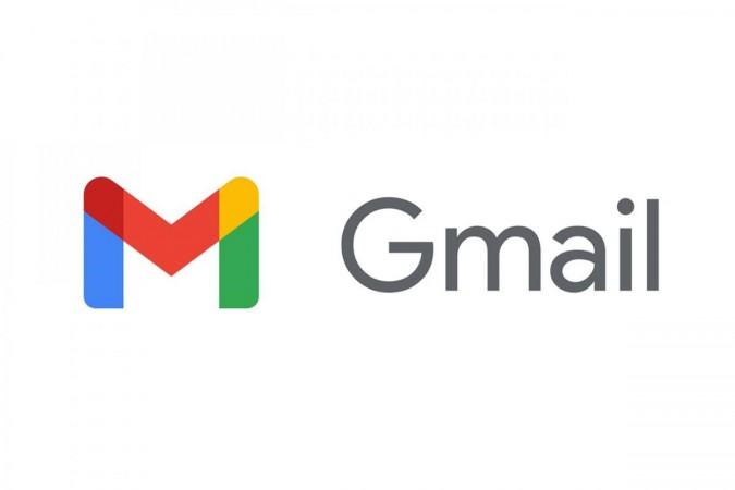
If you start your day by opening your Gmail, brace yourself to recieve a little surprise from Google. Google is replacing the iconic old white envelope with an all-new colourful logo which is in sync with Google's other colourful products.
The new Gmail logo is now a letter M made of four colours: blue, red, green, and a pop of yellow. This is the very quad colour combination used for all the other logos of Google platforms including Chrome, Google Maps, Google Photos, Play Store and more.

Google has also updated its Calendar, Docs, Meet, and Sheets logos to match the new Gmail design. The new logos are one part of a bigger remould of Google's G Suite software, which is now Google Workspace.
They murdered the Gmail Logo: Netizens react to the change
Change is always good but turns out everyone seems to be a little confused about the appearance of the new logo. One of the users said, "Google scale: take 5 iconic, visually distinct logos and ruin all of them at once."
Another said, "In isolation, I don't mind this new Gmail logo at all. Cleverly hides the envelope. But every time Google gives me another new four-colour app icon, makes it that much harder to pick the right one on my phone. I'm still getting used to looking for a Maps pin. Used to be a map!"


