Itel Mobile has launched three budget-oriented smartphones with full-screen displays - S42, A44 and A44 Pro. Itel S42 is the most interesting and feature-rich of the trio and could be a good alternative to many smartphones in the under Rs 10K budget.
International Business Times India reviewed Itel S42 and here are our initial thoughts about the device.
Itel S42 design
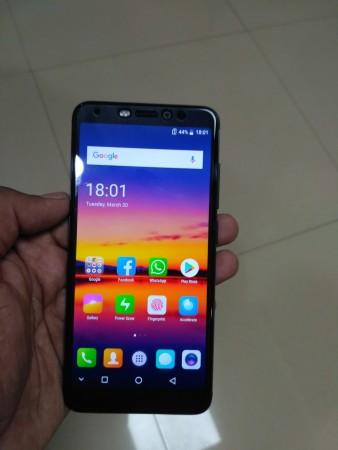
Itel S42 is not going to win any design awards, but it isn't that bad either. The bezels are not very small, but considering the kind of price it commands, we should not be complaining. That said, the phone feels pretty solidly built. It has got a good heft to it and you cannot hear any squeaks or creaks in the panel.
With rounded corners and the use of 2.5D curved glass, the phone fits perfectly in your palm and the weight also feels just right.
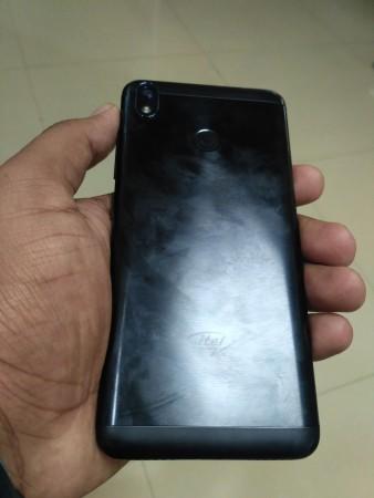
The metal back panel does give it a nice look, but we would have loved to see a glass panel at the back like on Honor 9 Lite. The matte black color variant that we have with us is a fingerprint magnet and tends to collect smudges very easily.

We would have still preferred Itel to stick to a solid matte finish as we are not a big fan of the brushed circular pattern on the back panel.
The camera module at the back houses the camera and the flash. It is vertically aligned and is slightly protruding from the back surface. It looks nice, nonetheless.
The fingerprint scanner is positioned right below the camera at the center of the back panel, and during our initial tests, it got it right almost 90 percent of the times. Only, it isn't as fast as the company claims it to be. However, Itel could improve that with a software update which will bring along the Face Unlock feature. We simply cannot wait to test it.
The power and volume buttons are nicely raised and provide good feedback too.
Itel S42 display
Moving on, the display up front looks vibrant and has very punchy colors, and it can also get very bright. However, the colors look a bit oversaturated for our taste. Although the screen resolution is just HD+ (720x1440 pixels), the on-screen content appears detailed and text looks crisp.
The UI, however, is not the best we have seen, even in this budget. The icons look a bit too colorful and cartoonish for our liking.
Itel S42 cameras
In terms of the cameras, the back camera certainly does not impress, at least indoors. The few pictures that we clicked have a lot of noise around darker areas, and for a 13MP sensor, we expected something better.
The front-facing selfie camera tends to over-saturate colors and faces look pinkish and reddish depending on the lighting conditions.
We haven't checked the cameras extensively so we'll reserve that for our detailed review.
Considering that it is one of the cheapest phones to offer Android 8.0 Oreo experience out-of-the-box, it will be nice to see how Itel S42 performs day-to-day tasks.
So, stay tuned for our detailed review.


