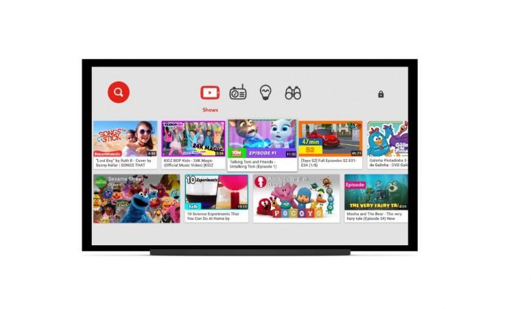
Search engine giant, Google, in a bid to enhance user-experience on its video app YouTube, has released a new update.
Based on user feedback, Google has made changes to the YouTube interface, especially to the navigation tab to help users switch between multiple videos seamlessly.
Also read: Motorola confirms new Moto phone launch on June 1; will it be Moto E4 or Z2 Play series?
"We're introducing an improved look for the YouTube Android app. The update provides a consistent layout across mobile and allows for easier navigation within the app," YouTube team said in a statement.
Here are salient features of the new update:
- Google has made the Navigation tabs' label look clearer and also moved it to the bottom, so, that the user's thumb can reach the tabs with less hassle.
- "Account" and "Library" have been separated to make the navigation simpler. User videos (e.g. playlists, watch history, uploads) are in "Library," while Account and Settings shortcuts are in the profile icon at the top.
- The navigation bars will now be visible on all pages (except for Watch).
- The app remembers where you left off on each tab. For example, if you scroll down through the Home feed, then go to your Subscriptions tab, and then return to Home, you can easily pick up from where you left off.
The new update for YouTube is already available for iOS version, whereas for the Android variant, it just started rolling out now. Since it is being deployed in phases, it will take a few days for the firmware to reach all corners of the world.


