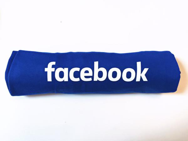
Facebook has made a minor change in the company's brand logo with a strong message that dictates the future. The change is barely recognisable and needs a little extra effort to spot the difference.
The company's aim behind a new logo is to make it appealing to the audience. The change in the new logo is hard to spot because it draws close similarities with the old one. In short, the new Facebook logo is lighter, slimmer and looks more casual.
The new logo is yet to be seen on the site, but the company's product designer Christophe Tauziet revealed it on Twitter early on Wednesday.
Say hello to the new Facebook logo pic.twitter.com/ofoFm4JQmK
— Christophe Tauziet (@ChrisTauziet) June 30, 2015
The blue wordmark logo on a white background remains the same along with the iconic "f" logo. What changes is the slimming down of each letter and the letter "a" has been changed from double-story to a single-story, Under Considerations defines.
"The 'o's and 'e' are rounder, and the "b" has a more traditional stem. In essence, this is a perfectly acceptable wordmark, a kind of twenty-first-century Franklin Gothic for the millennial generation. It has a great rhythm, it's perfectly crafted — although the left part of the "e" seems a tad heavy — and it's very nicely kerned," the publication explained the change in detail.
The new logo is created by Facebook's in-house design team in partnership with renowned typeface designer, Eric Olson, the man behind the original logo.
"When Facebook's logo was first created in 2005, the company was just getting started and we wanted the logo to feel grown up and to be taken seriously. Now that we are established, we set out to modernize the logo to make it feel more friendly and approachable," Josh Higgins, Facebook's Creative Director told Brand New magazine.


