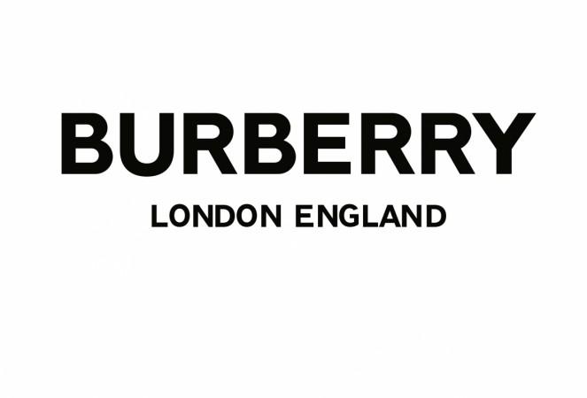
One of Britain's most iconic fashion brands, Burberry on Saturday revealed a new design language and logo. Created by graphic designer Ricardo Tisci in collaboration with British designer Peter Saville, the new logo left Twitter divided after many users lamented the change or lack of thereof.
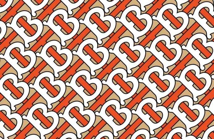
Tisci took to Twitter to unveil the new logo for the fashion house, that took him four weeks to create. He also unveiled a tessellated monogram, created from the initials of founder Thomas Burberry. While the wordmark logo was apparently praised by the company, fans have had more of a negative reaction.
Tisci, who recently joined the brand as creative chief, was given just four weeks to rebrand the company by Saville. The company shared copies of the conversation between the two on Instagram, which saw Tisci say: You need four months for a project like this!"
However, he managed to do it and Burberry joined the list of growing fashion labels adopting a new minimalist approach to their wordmarks. The first logo redesign in over two decades will now take over Burberry stores globally, and the monogram will become a big part of Burberry's marketing when they are officially adopted in September during the London Fashion Week.
"Peter is one of our generation's greatest design geniuses. I'm so happy to have collaborated together to reimagine the new visual language for the house," said Tisci on Instagram.
Fans took to social media to express their displeasure, with one person saying: "It looks like it's been done on Microsoft Word." The new wordmark is now in a sans serif font, with a much bolder look.


Twitter reactions
One of these is Burberry's new logo - it took 'the UK's most famous graphic designer' (Guardian, 2013) 4 weeks to create. The other, I just knocked it up in Word in 20 secs. Which is which?
— Rich Leigh (@RichLeighPR) August 2, 2018
Answer here (including a monogram that is actually quite cool): https://t.co/uAW5rH6pjl pic.twitter.com/HXDc7xJeOB
Yes everybody, you totally caught us: the new Burberry logo is just Peter Saville picking a font. Took him 5 minutes & he got paid millions. You figured out our big graphic design scam — this is why all graphic designers are filthy rich and only work 3 hours a week.
— Mitch Goldstein (@mgoldst) August 2, 2018
BORING, PLAIN, looks like everything else. The old logo is classy and had character and personality. The new logo looks cold and ordinary. Why is everyone jumping on the plain Jane bandwagon in design in an effort to be “modern”? And sacrificing all interest and artistic charm?
— Graphic Designer (@Linda_Sturling) August 4, 2018
So today all my timeline was complaining about the new logo of Burberry, now I can see why ..
— Erika (@nukketdesigner) August 4, 2018
I can't understand that "need" of turning all logos into sans serif, they all look so generic now https://t.co/psTVb1xEXY
Could have did this in 10 minutes for half the price. The font doesn’t feel right for Burberry.
— Devonta White (@FitFlyFellow) August 4, 2018


