Apple's 'Spring Forward' event is now done and dusted. And as expected, the highlight of the event was the detailed announcement about Apple's new Watch. Sure, there were other announcements also about other Apple products, but none got the kind of importance as the Watch did.
The Apple Watch comes with a built-in speaker & microphone that's meant to allow users to receive calls on the smartwatch itself. It also has a new technology called Digital Touch. "You draw on your watch, and that touch will be animated on your friend's watch exactly as you drew it," claims Apple.
The company says the smartwatch has an 18-hour battery life and will be able to run popular apps such as Instagram, MLB.com At Bat, Nike+ Running, OpenTable, Shazam, Twitter, WeChat and more. However, with nothing more to show by the company, we took it to ourselves to think 'what could have been' in the watch.
Hence here is our list of the 5 distinct features Apple may have missed out on for its new Watch.
Display that's Always-on
Similar to many other smartwatches in the market before it, Apple also faces some questioning, as far as an always-on display is concerned. Now, if you are wearing a watch on your wrist, the most probable thing that you will end up doing is check time every now and then. However, as with other such watches, Apple's Watch also requires some kind of signalling for it to know that you are indeed interested in knowing the time. Maybe the Watch does light up at instances when it detects motion, but an always-on smartwatch is still missing. We are talking about something similar to the Pebble Time.
No 'Sapphire Display' Class Segregation
We understand the economics of things and how the market works, and you would be almost naive if you don't comprehend the policy of "you get what you pay for," but fans are already crying foul over the decision to sort of segregate Watch users in terms of the money they have spent. The argument may seem a bit void, but Apple products anyway cost a mini fortune, and to pay something like that and still not be able to enjoy things completely is just not done. Take for example, the cheapest Watch variant, the Sport edition, which comes with an Ion-X glass coating. In contrast to this, the regular edition comes with a sapphire glass up top.
More Design Variations
It's not that the Apple Watch looks overtly bulky and doesn't compliment individual fashion sense, but since humans are different, our preferences are different from one another. Hence, if not completely revamping the looks of the Watch, Apple could have made it better with more design options for the Watch. Sure, the company is offering different watch faces to compliment your style, but some of us are not impressed with the design. Others, however, have already tagged the design as a tad "feminine."
Own Choice of Watch Bands
Talking about the variations craved in design, here's where we try and sneak in a bit of comparison – Apple Watch against Pebble Time Steel. Apple may not have done much about the designing factor of the Watch, as it was decided before hand, but it sure could have done a thing or two about the available watch bands for the wearable. Apple features a plethora of watch bands, such as Blue Classic Buckle, Rose Gray Modern Buckle, Red Modern Buckle, and more, but what sets them apart is the kind of price tags attached to them. Pebble Time Steel, on the other hand, is compatible with almost any standard 22mm band, although the company is said to be making Time Steel available to purchase with the a number of stainless-steel finishes and bands.
Carefully Organised Interface
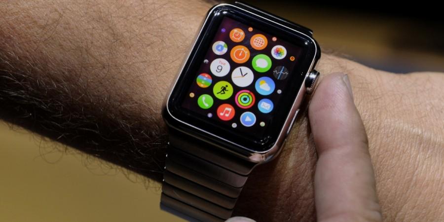
While the Apple Watch is surely one of the greatest technological marvels of this year, we wish for a better-designed, cluster-free interface for the Watch. The Apple Watch interface is somewhat clustered, compared to the more organized ones that we see for other Apple products. But Apple knows best.


