Motorola has been in the news of late for the upcoming Moto G6 series which will be launched as early as April 19. However, a fresh lineup of smartphones is not the only thing that the Lenovo-owned smartphone company will introduce this month. There's also a new software update in the pipeline – one that will spruce up the camera app on all existing Moto devices with a redesigned user interface.

The company has started rolling out the "new 2018 Camera User Interface," as it refers to it in the release notes on Play Store, ahead of the Moto G6, Moto G6 Play, and Moto G6 Plus launch. The update UI is centered around making switching modes easier. It now allows users to swipe to switch modes instead of tapping the unintuitive overflow menu in the previous app.
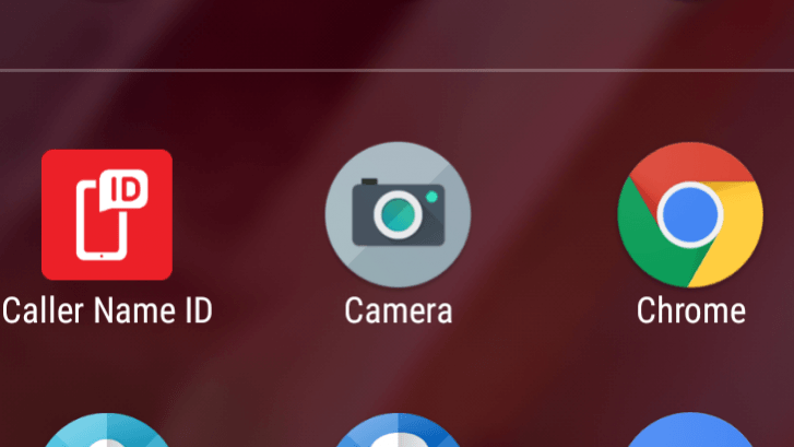
The first change the update brings is in the icon, which now matches the look of the new icon theme that will debut on the upcoming Moto G6 series.

There's absolutely no doubt that these new phones will launch with the revamped Moto Camera app, but existing Moto users needn't worry as the update will also make its way to their older Moto phones including the Moto G5, G5 Plus, and the Moto G5S Plus.
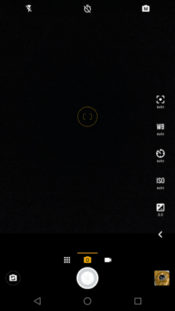
The biggest change, however, is how you choose between shooting modes. With the new interface, you can swipe between photos and video.

Inside the app, there are now three sections at the bottom, with the default being 'Photo' mode. A swipe to the right gives quick access to video, while a swipe to the left opens up the modes screen with buttons for panorama, slow-mo video and camera settings. You can change the mode by simply swiping sideways on the screen.
On the old app, all the modes and options appeared on the right side of the screen after tapping an overflow button.

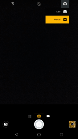
At the top of the viewfinder is the app bar housing options to change HDR mode, flash, timer and now a toggle that allows you to switch between auto and manual modes. The top app bar is also now more transparent so that users can see more of the viewfinder.
Switching to Manual mode presents additional options on the right, similar to that in the previous version.
Talking about the camera settings menu, while in the older app the navigation drawer housed the settings and you had to swipe into the settings screen from the main viewfinder and the settings menu would be superimposed over the footage on the viewfinder, the new app has its own independent settings menu which can help a little with the visibility considering all the options available. Meanwhile, the various options and customizations remain unchanged.
In addition to all these layout changes, the new app also brings a tweaked color palette for the camera interface. The new app drops the light blue icons and text in favor of a bold mix of white, black and gold.
Motorola has just begun rolling out this update and despite the Play Store indicating the availability of a new release, the changelog still describes the older version. The app will be rolling out slowly over the course of the next few days and Motorola will hopefully launch it on the older devices too, although there's a possibility that very old Moto devices won't get it.


